library(tidyverse)
library(grid)
library(plotly)
library(plotscaper)Lab7 - Interactive Graphics
See the assignment description and model answer (for the source .Rmd model answer, just change “html” to “Rmd” in the link).
Loading packages.
The data and questions of interest
Data shows rows of incidents handled by the Police.
crime <- read.csv("nzpolice-proceedings.csv")
crime$Month <- as.Date(crime$Date)
crime$Year <- as.POSIXlt(crime$Date)$year + 1900
typeCount <- table(crime$ANZSOC.Division)
crime$Type <- factor(crime$ANZSOC.Division,
levels=names(typeCount)[order(typeCount)])
crime <- subset(crime, Year >= 2015)Create data with counts.
counts <- as.data.frame(table(crime$Type, crime$Month))
names(counts) <- c("Type", "Month", "Freq")
counts$Month <- as.Date(counts$Month)
counts$Abbrev <- counts$Type
levels(counts$Abbrev) <- sub("(.+?)(,|and|With|Offences|Endangering)(.+)",
"\\1", levels(counts$Abbrev))Questions of interest
- How do the trends over time differ between types of crime?
- Are all crime types decreasing in frequency?
- Are there any unusual patterns for any crime types?
Data visualisations and questions
Question 1
We create the interactive plot by using the plotly::ggplotly function on our created plot, where we take advantage of the unofficial aesthetic text supported by plotly to create tooltips to ensure we get the entire crime type label on the tooltip.
plotly::ggplotly(
ggplot(counts, aes(x = Month, y = Freq, group = Abbrev, color = Abbrev)) +
geom_line(aes(text = Type)),
tooltip = c("x", "y", "text")
)We can zoom in the interactive plot and save to png directly in the interface to investigate and capture things in data.

We can choose interactively what groups to include in the plot by simply clicking them in the legend.

Aswering questions
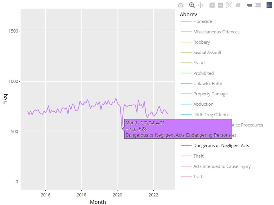
Using tooltip, we see that the sudden dip for Dangerous or Negligent Acts occured in April of 2020 as shown on the below screenshot.
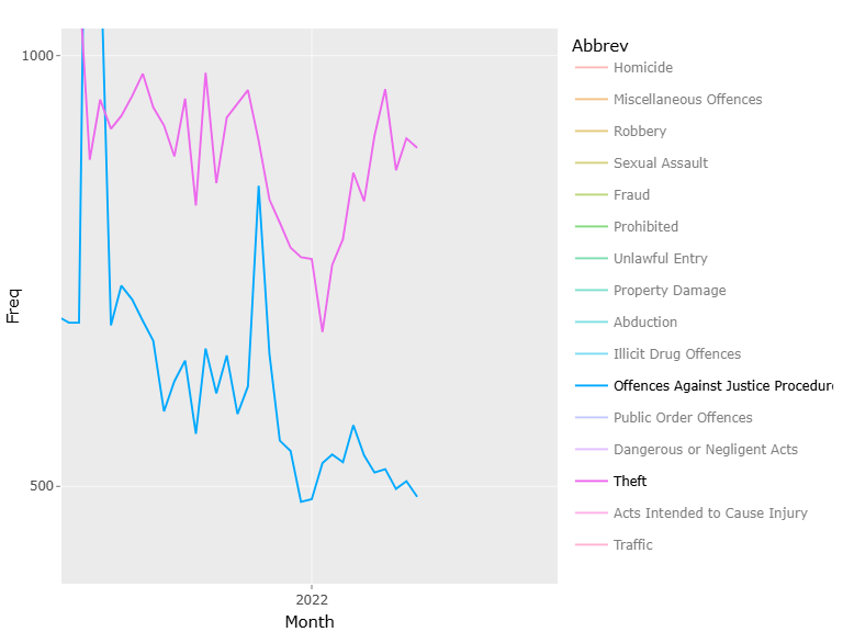
- In the same month that Dangerous or Negligent Acts takes a big dip, Offences Against Justice Procedures, Govt Sec and Govt Ops and Miscellaneous Offences has very big spikes. Some of the spike for Miscellaneous Offences is visible on one of the above screenshots.
- The trends in Public Order Offences and Dangerous or Negligent Acts are complete opposite as the latter is on an upward trend throughout the period, whereas the former is on a steep downward trend. Can be seen from earlier screenshot.
- Fx. Theft and Related Offences is on a downward trend except for increasing from year 2022 onward, as is true for other categories as well. However, for Offences Against Justice Procedures, Govt Sec and Govt Ops this is not true. Except for a big spike, the frequency of crimes for this crime type is close to constant, but does see a bit of a decrease from about 2022. See figure 4.
- Sexual Assault and Related Offences and Prohibited and Regulated Weapons and Explosives Offences have very similar trends across time with white noise around a quite static mean. However, both around year 2020 and 2022 Sexual… dips a bit while Prohibited… increases. See figure 5.

Question 2
Limit the data to be only from 2021 onwards
crimeRecent <- subset(crime, Year >= 2021)Create the linked interactive plots with plotscaper with the correct layout by creating a schema with create_schema and using the set_layout function to control the placement of the figures.
schema <- crimeRecent %>%
create_schema() %>%
add_barplot("Type") %>%
add_histogram("Age.Lower") %>%
add_barplot("Date")
layout <- matrix(c(
1, 2,
3, 3
), ncol = 2, byrow = TRUE)
schema %>%
set_layout(layout) %>%
render()